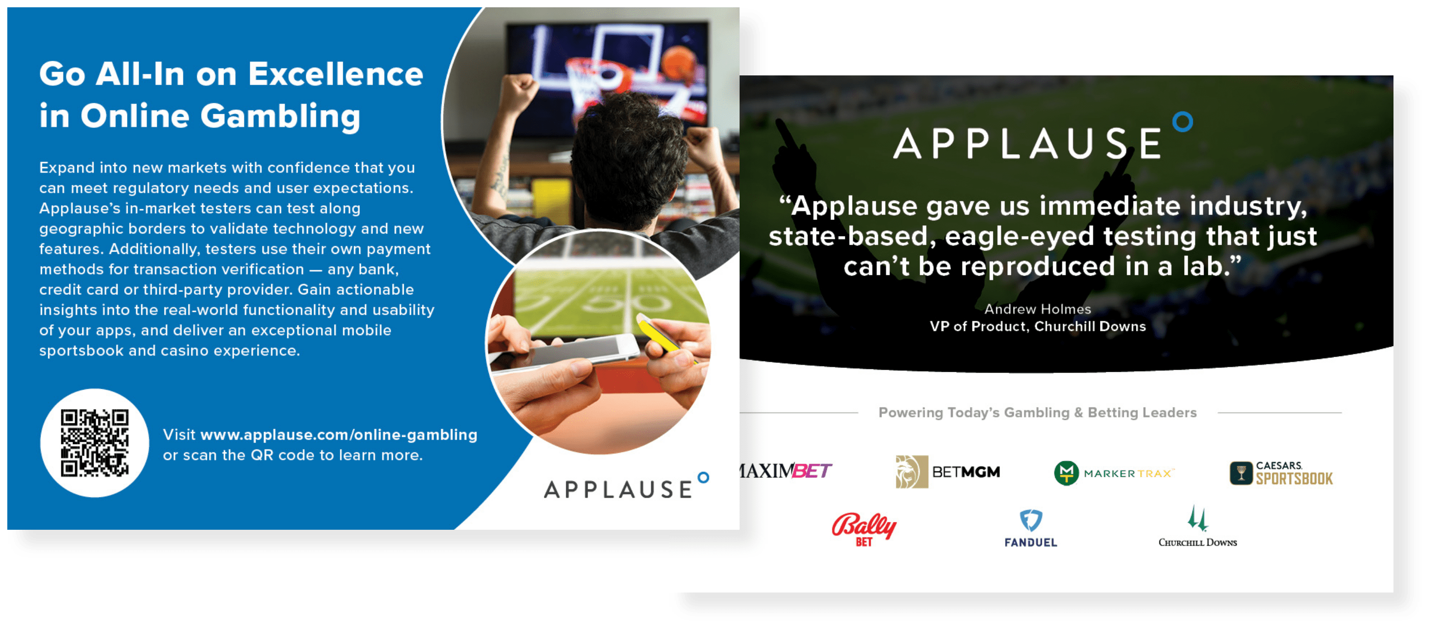
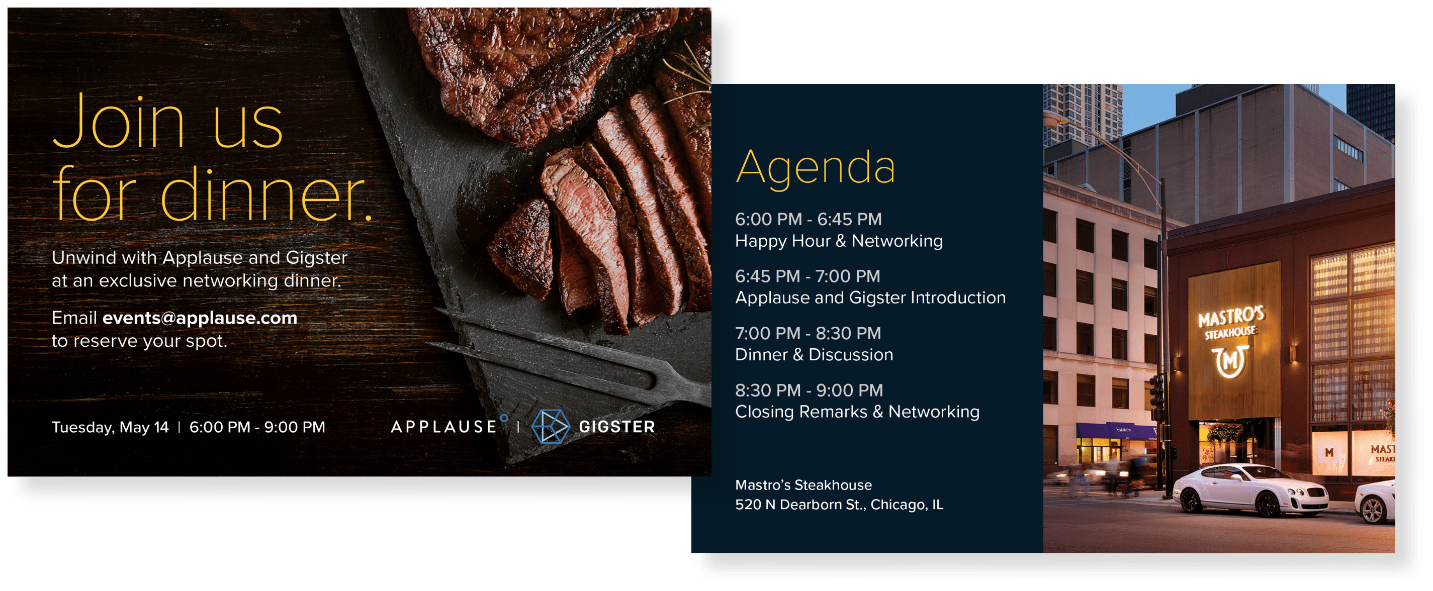
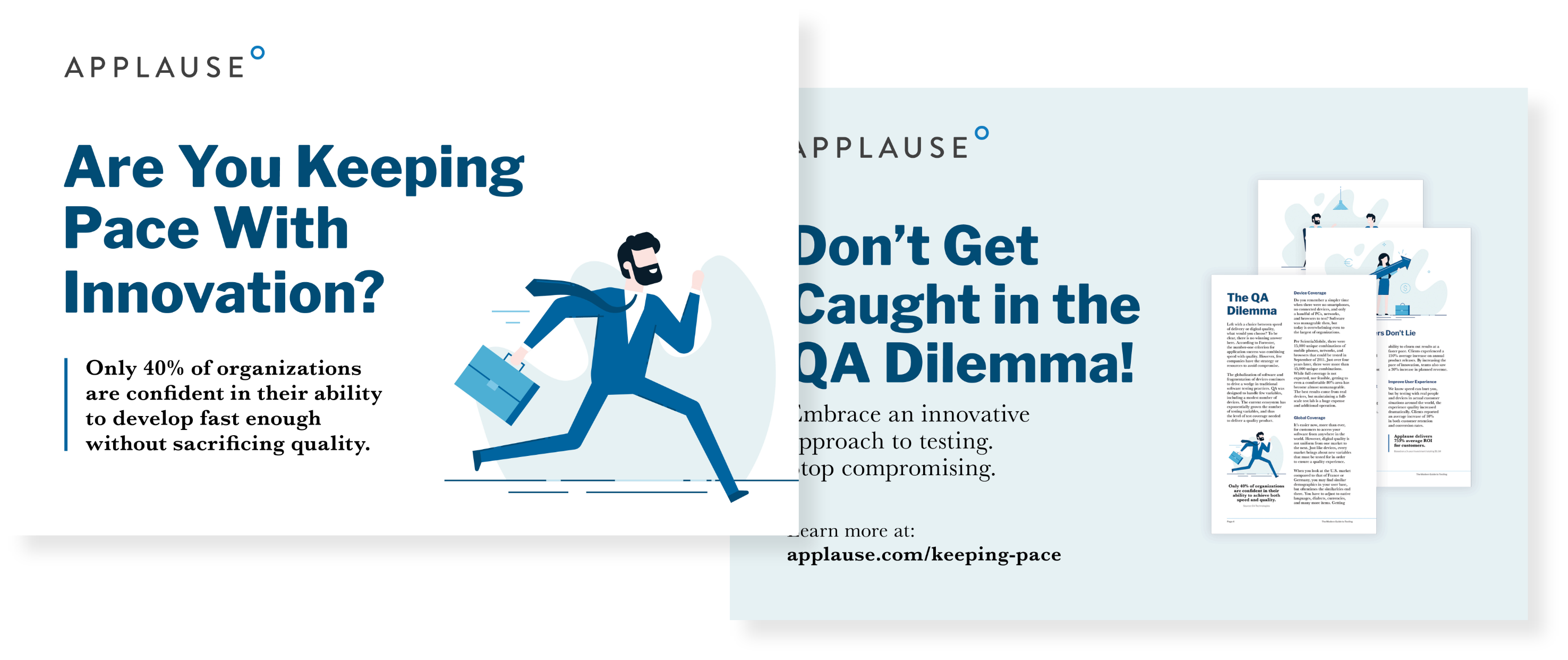
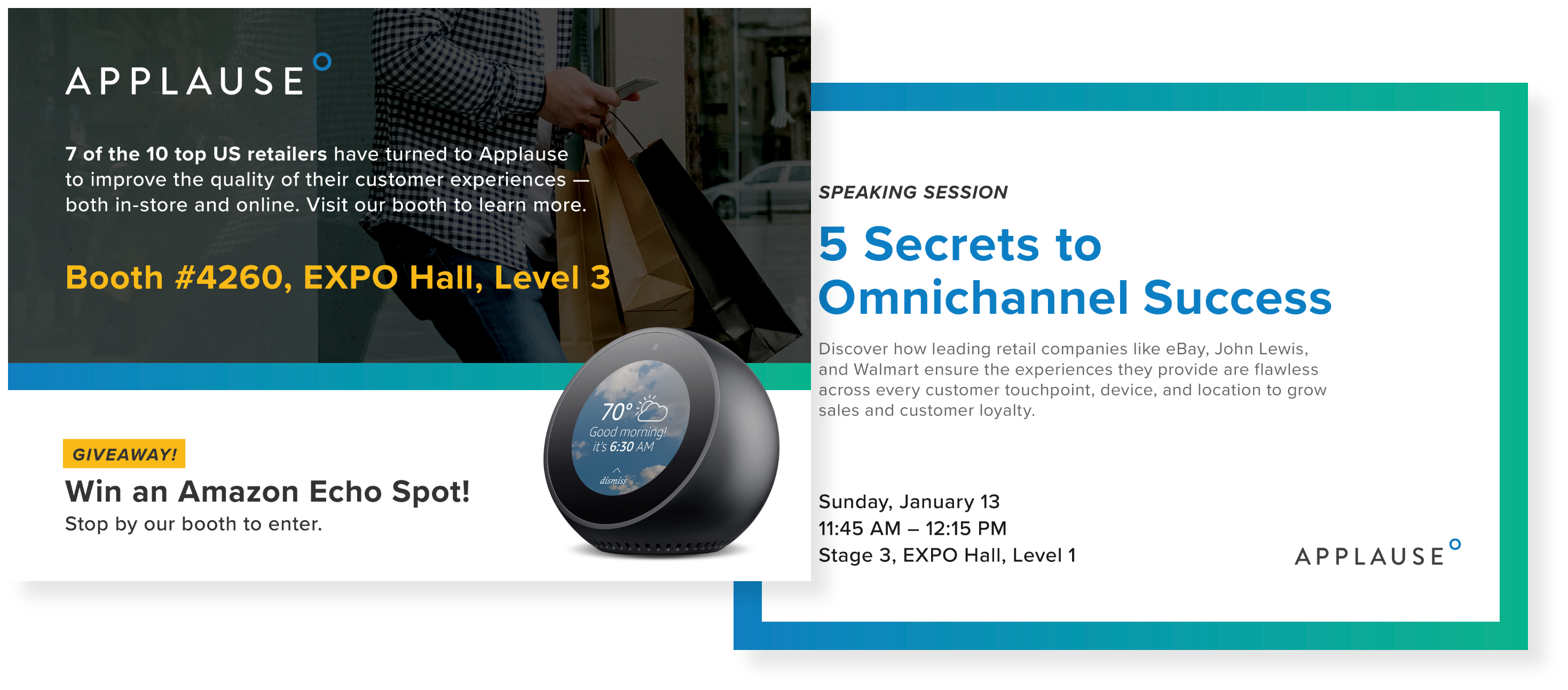
Event & Prospecting Collateral for Applause
A variety of targeted postcards and flyers designed for field marketing events, direct prospecting, large-scale trade shows, and hiring events.
Print materials in a fast-paced event environment have to work hard to capture attention. Whether designing a sleek promotional postcard for a VIP dinner or an informational flyer for a crowded recruitment convention, my focus was on:
Brand Consistency: Translating Applause’s digital-first brand identity into clean, high-quality print layouts that maintain visual integrity across different paper stocks and finishes.
Skimmable Hierarchy: Organizing technical testing solutions and employer value propositions into easily digestible, scannable layouts that quickly communicate "why Applause."
Clear Calls to Action: Placing strong, prominent CTAs, such as dedicated landing page URLs and custom QR codes, to seamlessly bridge the gap between offline physical handouts and digital engagement pipelines.